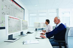
Photo 1: A user-centered human–machine interface creates optimized working sequences, supports and offloads plant operators, and ensures improved plant efficiency.
Today, most plant operators are much more than classic process operators. In addition to operational process control, their range of tasks includes product quality assurance, optimization of resources, and maintenance of high‑throughput rates. Qualified information is necessary to reliably perform those tasks. The human–machine interface (HMI) of a process control system provides visualization. Siemens regards new HMI concepts such as advanced process graphics (APG) as the key to task‑specific or situation‑specific decision‑making (Photo 1).
Graphics Monitor: the Process Window
Before computer technology found its way into control rooms, the window into a manufacturing process was provided in part by huge switching and display panels. Process value displays were grouped according to their importance and tasks of operating teams. Back then, operational experience was an essential component of day‑to‑day work. With such experience, a plant controller could determine at a glance whether a plant was “in the green range.” Increasing plant complexity, expansions, or modifications required additional displays and took mosaic panels to their limits.
The 1980s changed the look of control rooms enormously. Monitors now displayed important operating parameters — still on a black background and with a maximum of eight colors. Analog indicators of instruments used at the time could not be displayed because of their complexity, so such indicators were replaced with simple numbers. An alphanumeric display of process values meant that individual operators had to estimate whether a value was within the target range. That is often still the case today. A display of process trends also was not technically possible, so experts frequently replaced them with alarms that increasingly became more of a nuisance than an aid.
Graphics and computing power increased over time, and it became possible to represent plants fully on the basis of piping and instrumentation diagrams (P&ID). This basis for implementation — coupled with the fact that computer graphics progressed — made possible even more “realistic” representation of manufacturing plants. With their brightly colored, flashing monitors displaying not only a host of values, but also small flames flickering in stylized furnaces or simulated smoke from chimneys, control rooms often came to resemble video game arcades. A plant operator’s life has become more complex with large volumes of data from process lines, high‑resolution monitors with split‑screen technology, and an increasing range of tasks and responsibilities. Multilevel menu prompting, simultaneous operation of diverse systems with different methods of representation and operator philosophies, and difficult‑to‑access information increase assimilation difficulties and lead to overload. Even without increased process complexity, operator errors can result.
User Capabilities
Operational control of a process plant cannot be compared with operating an app on a smartphone. Intuitive operation is a result of well‑structured user interfaces that prioritize not only the possibilities of technologies, but also capabilities of users. User experience design (UX design) takes into account a user’s experience and a plant controller’s level of expertise when structuring operator interfaces.
Fundamentally, that means that the representation concept must be oriented around diverse tasks of an operator. It must determine the information that is relevant to each specific task. The design must present that information in a way that remains comprehensible to operators in relation to context and with sufficient detail, taking into account qualitative and quantitative aspects.
On the basis of that information, operators always must have an eye on their facilities’ status and sections important for their tasks. They must be able to make assured decisions for action. Fill level (the ratio of screen surface filled with characters to overall screen surface) and attention control and consistency are important in graphics design. For example, the Association of German Engineers and Association for Electrical, Electronic, and Information Technologies have published rules and recommendations for structuring the representation and operation of fully graphical screen systems for process control (1).
Situation‑related attention incorporates several levels: An operator must be made aware of what is happening at a given instant, what it means for a specific task, and what conclusions can be drawn for subsequent working steps. Consistency refers to the identical appearance and behavior of objects in the schematic representation of a task (1). That includes primarily identical representation, use of uniform terminology and symbols, and identical sequence of operations and behavior.
Ergonomic Process Visualization
Based on EEMUA Publication 201 and VDI/ VDE Guideline 3699 (2), Siemens has placed users and their tasks at center stage in the development of the APG option package (Figure 1). Aside from defining operator tasks, which are different for each plant, operators must be involved in a design process early. An integrated, consistent, unambiguous, and very simple HMI design is developed based on those tasks and processes.
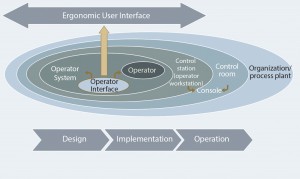
Figure 1: Focus on the operator: the basis of an ergonomic user interface for industrial process control in accordance with EEMUA Publication 201
Design development starts with simple but effective measures in the use of colors, contrasts, shapes, and connections. Designers should limit the use of red and yellow to the visualization of alarms and threshold values on process displays (which otherwise should be calm and discreet in color). That step satisfies, among others, the most important requirements concerning targeted influence of attention and unmistakable recognition of patterns. Plant equipment should not be displayed as three‑dimensional (3‑D) images or use certain colors for more than one purpose. The only meaning of red is “critical status.” So it should not be used to depict a closed valve, for example.
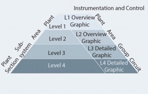
Figure 2: Always have the right thing in view: hierarchical organization of graphics screens in accordance with VDI/VDE Guideline 3699-3.
Equally fundamental, and in line with VDI/VDE 2699‑3, is the hierarchically organized representation of graphic displays (Levels 1–4 ) according to plant section, subsystem, plant area, and overall plant (Figure 2). Until now, instrumentation‑oriented Level‑3 graphic displays have dominated the monitors of operator teams at the level of subsystems. The APG concept focuses on Level‑2 displays (information‑oriented overview and group displays that supply operators with all information necessary for their tasks). They combine related data that previously had to be sought out by plant operators from several Level‑3 displays, noted, and related to each other. Raw data are already transformed into valuable information through their presentation.
From Fuel Gauges to Trend Displays
The following example illustrates how this information process functions: Analog indicators represent a vehicle’s fuel level, showing a driver at a glance how full a fuel tank currently is. By contrast, a numerical value such as “40 L” says nothing about fuel level unless a driver knows the total number of liters of fuel the tank holds. The value must be put in interpreted by the operator (driver). In addition, a fuel gauge has a limit: The reserve indicator informs a driver that action (refueling) must be taken. A numerical value such as “5 L” instead of “40 L,” without visualization of a limit, requires mental effort because the driver has to know that at a level of 5 L, the tank is almost empty.
Modern vehicle‑information systems offer more than analog fuel gauges. They provide information about the remaining range, taking into account fuel levels and consumption with given driving styles. With this trend information, a driver can make decisions about the course of a journey, such as, the time for refueling. This example makes the issue clear with just a single value. A plant operator must keep an eye on dozens of values, some safety‑ related — a very much higher load.
Display Concepts
Transferring that simple example to effective process control, we encounter hybrid displays, trend curves, and Kiviat diagrams that supply operators with information instead of data. Measured values also must be displayed so that an operator can see at a glance whether a system is within its optimal working range. The bars/ columns can be scaled with their setpoints or optimal values in the center, so deviations are clearly visible (Photo 2).
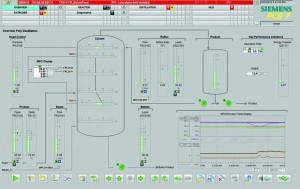
Photo 2: Acceptable range immediately recognizable; the view of a distillation column with vertical temperature course immediately shows that the highest value is outside optimal temperature range.
For predictive plant operation, another suitable type of information display is trends in the form of curves. This type of display is not new. Any process control system can display trends, but that is often associated with a great deal of effort. Operators must find corresponding values, place them in relation to one another, define the scale, and much more. Important trends must be continuously visible in Level‑2 displays. Representation of measured values in relation to time enables operation according to setpoint ranges rather than alarms. Clear indication of the optimal range is important here. With the help of trend displays, better statements can be made about near‑future operations. You can determine quickly whether a value is moving in the right or wrong direction. For example, a combination of trend and hybrid displays ensures more clarity in level displays.
With increasing experience, you can assess a situation by recognizing specific patterns such as Kiviat, spider, or radar diagrams. You can apply several measured values at an appropriate scale on axes arranged as on a spider’s web, for example. Individual points can be connected by lines that enclose an area whose form and size provides information about, for example, an overall quality based on several reference variables. This visual method allows an overall relationship to be quickly established and memorized as a pattern (Photo 3).
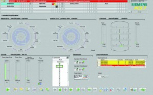
Photo 3: Fast recognition of patterns; a Kiviat diagram clearly presents all parameters for polymerization.
User-Oriented Approach
Advanced process graphics help improve process visualization through user‑oriented implementation of methods presented here and others. APG reduces the challenges faced by plant operators and ensures that their work is simplified and made more effective — despite increasing complexity and the expansion of operator tasks. Instead of displaying data, APG offers task‑oriented and target‑oriented information. In Simatic PCS‑7 installations, this HMI concept ensures that situation overviews can be quickly assessed, thereby allowing rapid decision making, fewer operator errors, and higher product quality and plant availability.
References
1 VDI/VDE Guideline 3699: Process Control with Screens. Association of German Engineers and Association for Electrical, Electronic, and Information Technologies: Frankfurt am Main, Germany, 1997.
2 Publication 201: Process Plant Control Desk Utilising Human-Computer- Interfaces — A Guide to Design, Operational, and Human-Computer Interface Issues. The Engineering Equipment & Materials Users’ Association (EEMUA): London, England, 2002.
Svitlana Schmitt is a marketing manager in the process automation unit of Siemens AG, Process Industries and Drives division, Karlsruhe, Germany; +49 911 895-0; contact@siemens.com.
